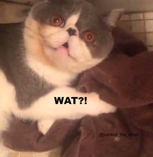
Sometimes, you look at a magazine cover and just think …

That’s how a number of people reacted when they saw the September cover of the new Spanish Vogue, featuring Penelope Cruz. Seriously, the magazine didn’t do her justice.
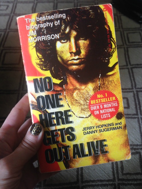
But I’ve been pondering the matter of the totally inexplicable magazine cover since last month when I was discussing the Doors with a friend at dinner. I was reminiscing about the huge resurgence in interest in the late Jim Morrison triggered by the 1980 biography No One Here Gets Out Alive and its super-attractive cover photo.

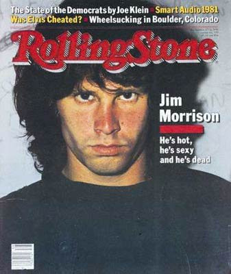
My friend and I recited the famous cover line from the September 1981 issue of Rolling Stone: “He’s hot, he’s sexy and he’s dead.” Then I was like, “Wait a minute! Did we get that right? I better check.” I looked it up on my phone and we had, indeed, gotten the line right.

But, as my friend pointed out, what’s up with the photo the magazine used? Compared to the book cover, the magazine’s choice looks more like a driver’s license photo. Jim still looks good but a little more oomph would have gone well with the “hot, sexy, dead” line, right?
I HAVE NOT BEEN ABLE TO STOP THINKING ABOUT THIS!!
SOMEONE TELL ME HOW THIS HAPPENED!!!
By the way, the most frequently visited post on my blog is related to the Doors. I wrote it because of the 2014 death of the mother of Jim’s late girlfriend Pamela Courson. I’ve never been able to track the source of the surprising amount of traffic, which comes from all over the world, every day. My dinner companion suggested that a link to it wound up on a forum somewhere. That seems possible. Anyway, if you’re visiting because of that post, please tell me how you found it. I’m dying to know!
It’s just ridiculous how some magazines are willing to lure readers to buy their piece of paper or to get fame in internet and social media by scandalous covers. I myself just try to avoid those magazines, which seem to “whore” attention any possible way.
I kind of like that cover. He looks extremely lackluster and tired. Sort of, well, dead 🙁
Good point. If they had made the word “DEAD” really big compared to the rest of it, it would make more sense.